
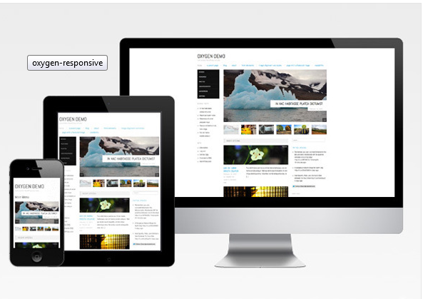
What’s a Responsive Theme?
Responsive themes use fluid layouts, flexible images and media queries to make your site look and act great on a variety of devices. Sidebars and navigation menus collapse gracefully, and retain functionality. Approach designs vary, and you should check out how each theme handles display when real estate becomes narrow. Many themes provide live demos that show how a site would look if the width was very narrow. On a desktop, you can experiment by narrowing the browser window for these themes to see how they respond.
Responsive Themes Available on the Common?
To find all our responsive themes, go to Appearances >> Themes on your blog dashboard and search our installed themes for “responsive.” Most of our current theme selections. If you have questions about the theme you are using, try minimizing the display width and see if you like the way your content displays. If not, maybe try a more modern theme.